
Black and White Lamp Styled 3 Ways & Helpful tips
Note: The products listed (including the black and white lamp) are sponsored by HVLG. I appreciate their support and together we are teaming up to bring you unique design ideas. The opinions are 100% my own
We are making-over our basement and I just received some lighting from Mitzi (a member of the Hudson Valley Lighting Group). Two of the boxes revealed a pair of black and white Faith lamps.

Black and White Lamp Styled 3 Ways
What I love about this black and white Faith lamp is that it is so incredibly versatile in my home. So versatile, in fact, that I gave myself a challenge: Try to style this table lamp in three vignettes in under twenty minutes. As I critique these images I see room for improvement…but 20 mins is NOT a lot of time you guys. Let me show you what I came up with and explain areas for improvement in my styling. Hopefully my self critiques give you ideas for styling your own home.
Black and White Lamp Vignette 1

I like this vignette the best of the three. We have a variety of heights, textures, shapes, and types of items and materials. By materials I mean wood, organic (plant), leather, brass, ceramic, etc. I followed the rule of odds. As I look at this scene my eye bounces up and down from item to item, but the organic plant provides a a little balance to the height of the lamp. However, since the plant is shorter than the lamp my eye looks to the left at the vignette and notices the fringed sofa and moulding, thus adding cohesion to the space.
I like the way that I have stacked two unlike pieces of art. The modern print adds a sense of vitality, while the vintage oil adds soul. By stacking the art my eye is drawn up. This makes my vignette (and ceilings feel taller).
Also, and this one seems silly to say out loud, especially since I don’t always follow it…This vignette receives “side-light” from the windows on the left side of the room. I like the way the shorter plant allows the light to kiss the space. The taller lamp nestles in the corner, thus adding a punctuation mark to the sentence.
Does this make sense?
Black and White Lamp Vignette 2

This vignette is my least favorite. The thing that bothers me most persoanlly is the imbalance. I see a blank spot on the right side of the table below the mirror. I wish I would have added something taller, and preferably living…think flowers or a plant.
Also, the rug looks too short and out of place.
However, there are a few things going for this space. Notice how I have pink in three places? That’s good. It reinforces that the color was purposeful. In the context of an entire room a color should be repeated three times, in three different vignettes. This adds cohesion.
Another thing I like about this space is the repeat of graphic elements (black and white lamp, wallpaper, railing, rug, etc) I also like the way the lighting plays well together. They all coordinate without feeling matchy matchy.
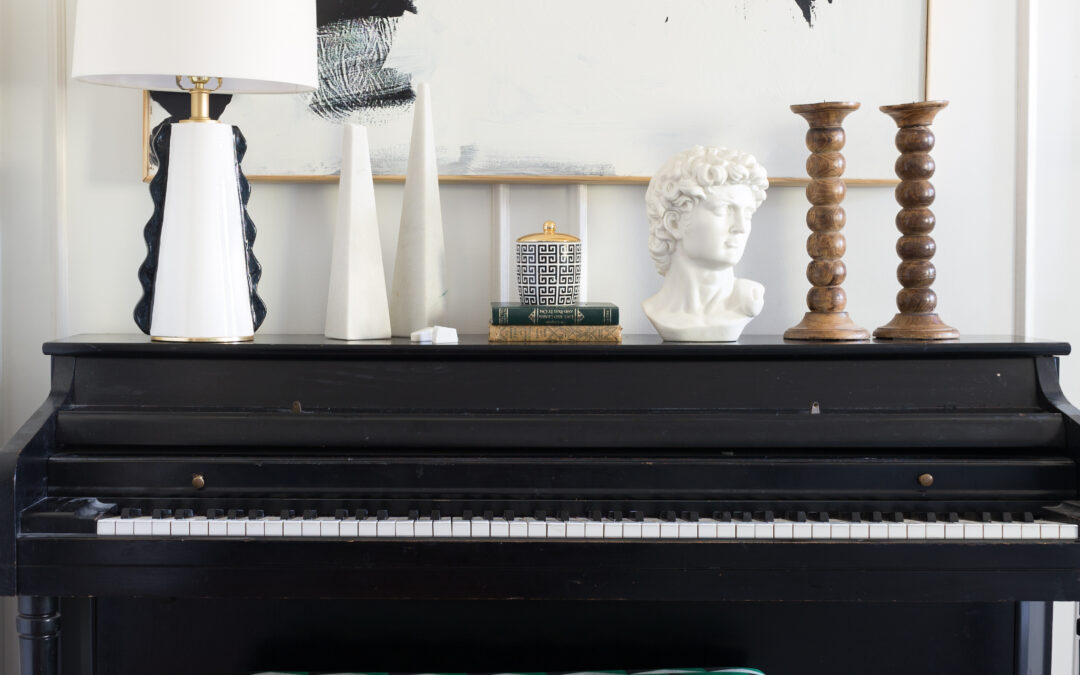
Black and White Lamp Vignette 3

All right, this one is ok for me. There are things I like (the graphic repeat again), the punch of color, and the mix of textures. I followed my made-up “shorter item towards the side-light and taller item in the corner rule”.
We have a wood element, that is good, but those candle sticks feel a little off to me. Maybe because they don’t have candles (or something else) on them…or maybe because I want the two of them to be different heights.
Adding a plant would help soften the space.
I give it a passing grade, but not my best work….but 20 mins you guys…I mean..
Hopefully these explanations make sense. Some of these tips are things you might read in a design book. Other things, however, are just the way I see the world…so don’t feel like it is canon. It is more of a break-down of how I decorate. That’s the fun of design, it is all subjective and creative.
What I love about these black and white lamps
Regarless of how well I’ve styled a space or not, it is fair to say that the black and white Faith lamp looks killer in each of these rooms. It adds a punch of playful personality, and I truly feel like it could live most anywhere in my home.

My favorite part, hands down, is the black detailing. That’s not all though. The scale, color of white, and quality are good too. I am sincerely excited to own a pair of these Faith lamp for my own home.
Stay tuned to see where they end up!

I know it’s just an expression but as an animal lover and advocate please don’t use it – there are a million ways to skin a cat. Unfortunately, there are evil people that do extremely cruel acts to animals. Thank you. I just cringed when I read it. Words are very powerful.
I love the lamps. The only suggestion I have is to the last vignette. The wood in its natural state, does look out of place. You could paint them green to bring out the green in the piano bench or white and use green candles. I really liked it other than the wood candle sticks in their natural state. But I would keep them natural and find white, black or clear candlesticks but you only had 20 minutes. I could do one in 20 minutes but not three so that is very impressive.
Thanks Debbie. I’ll go back and change the phrase. I definitely don’t want to offend anyone. ❤️. I think that is the fun part about design, our brains all work differently, so it is fun to hear how you work approach it. Thanks for your feed back.
I actually don’t mind the blank space in the second one… I think it lets the wallpaper shine!
And I find that all of these vignettes are too full. I would prefer the second one, if you removed the candle, books and rock, and move the large horizontal bowl with scarf just slightly away from the lamp. Then maybe try something more traditional instead of that mirror to contrast with the modern pieces. I do like a lot of negative space though and you may not.
I love the we all have our own take on it. That’s the fun of it all!
I know she most likely won’t see this but geez Debbie stop imposing your convictions on others. ? Get a grip.
Too full?! I need to just log out right now. I’m done with all these design critiques. If you guys don’t have anything nice to say…. you know the rest.
It’s ok Ken. I’m sure she didn’t mean any offense. None taken…But I appreciate your kindness ❤️. Constructive criticism doesn’t bother me.
I don’t think Yarrow’s comment was constructive criticism, just her opinion on what she likes. I personally wold not want these vignettes this full either, but Yarrow’s suggestion is too blank for me as well. A happy medium? Keep up the good work Jewel. You have great style and your home is so different than others out there. Keep being you!
Thanks Emily!