
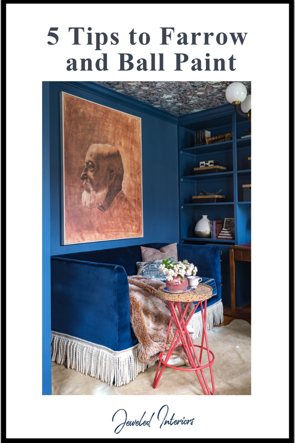
5 Tips to using Farrow and Ball Paint
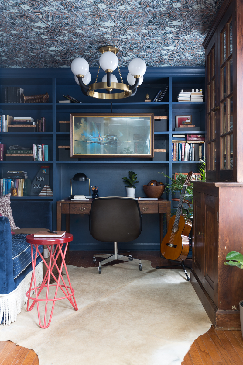
Thanks to everyone for the many kind compliments about my husband’s office reveal. I wanted to share 5 tips that I learned using Farrow and Ball Paint.
The Plan | The Reveal | Reveal #2 | Tips to using Farrow and Ball Paint (you are here)
Note: The Stiffkey Blue paint in my husband’s office was sponsored by Farrow and Ball but the opinions and advice are my own.
Farrow and Ball Tip 1
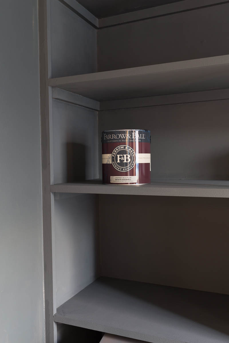
Picking a Farrow and Ball Color
Picking a paint color is often tricky because there are usually many elements to consider (other colors in the room, personal preference, use of the space, etc). I know volumes have been written on this subject, but I want to take a second to address one element that I think is often confusing: How does the direction of the windows in a room affect which colors and undertones should be selected in paint color. Why might a particular white look pretty in one room but too yellow or stark in another?
It all comes down to the sun, it’s path, and characteristics. We all know that the sun rises in the East and sets in the West. This means that first thing in the morning it hits northward facing rooms and then curves up and over eastward facing rooms in the mid morning. After this it spends the rest of the day in southward and westward facing spaces.
Also, it is helpful to keep in mind that morning light is less intense and cooler (less yellow) while afternoon light is more intense and warmer (more yellow).
In general (though not always), picking a paint color that is the opposite of the sunlight that is hitting the room at its most intense time will balance out the tones. If the natural light in a room reads overly warm, then picking a toned down/gray downed color would be lovely.
The two types of rooms that are most affected by this are North and South facing rooms. Eastward and Westward rooms are a bit more versatile. See below.
Northward Facing
Morning light from your windows feel naturally cool. To combat this avoid gray, green, or lavender undertones and pick something a bit warmer. A white with a slightly buttery undertone would look pretty. Try Yellow Ground, New White and White Tie.
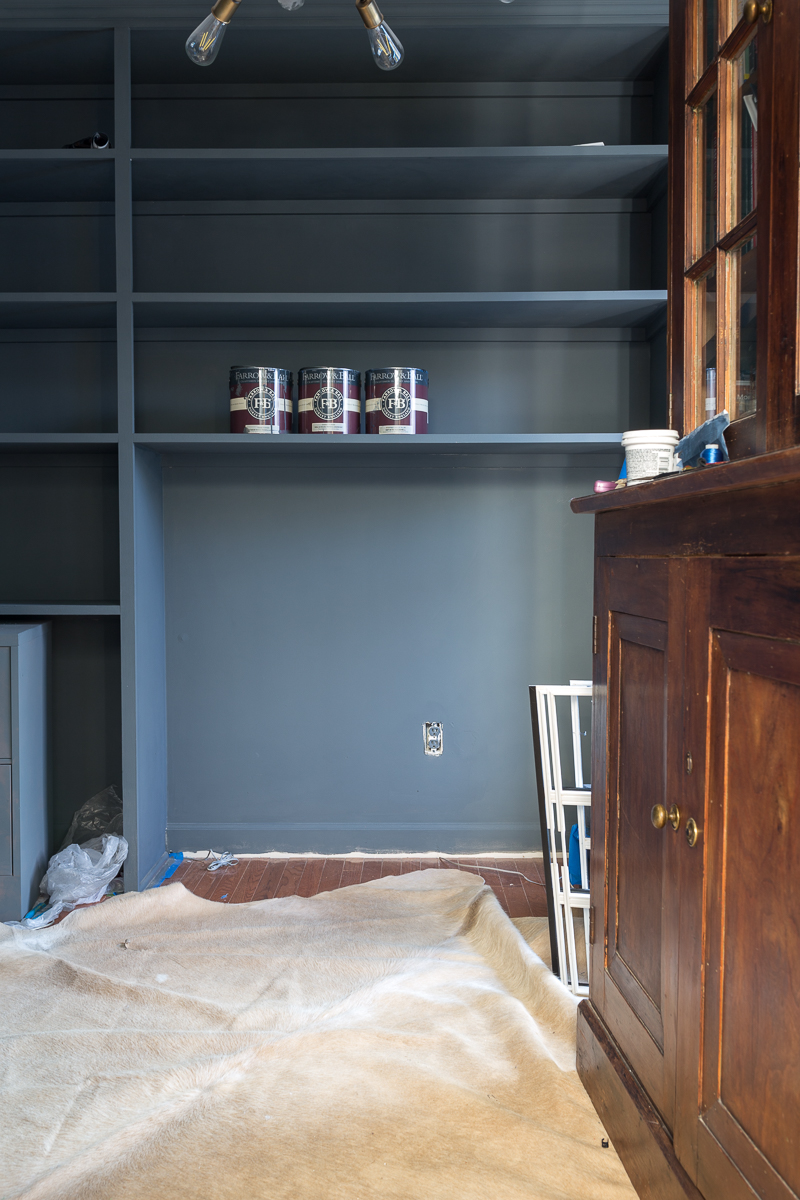
Option 2: Use the natural light to your advantage and go with a dark cool color. Try Railings, or Stiffkey Blue.
Eastward Facing
These rooms get clean light in the morning and less light throughout the rest of the day. They can handle green or blue paints. Warm pops help balance the room during the afternoon and evening. Breakfast Room Green No. 81 is a stunning eastward facing color that still retains it’s warmth in the afternoon.
Southward facing room
Southward facing rooms are warm and beautiful as they get light throughout the day. Colors that are too warm or too intense, however, may seem garish. You may want to avoid colors that are overly yellow, orange, or gold-tinted creams. Perhaps opt for blues, grays, greens, and crisp clean whites. Be aware, however, that brighter and more intense colors may look too bold. For example, a blue that looks lovely in and eastward facing room may look like a little boy’s room if painted on a southward facing room. A grayed down version will feel more sophisticated.
Westward facing rooms
We all know that the sun sets in the West. This means the morning light in westward facing rooms is indirect and clean and it gradually warms and intensifies throughout the day. While both Westward and Eastward facing rooms have a little more flexibility (can handle slightly warm or slightly cool colors) you may want to look for a crisper, less yellow whites. This is especially true if you spend most of your time in this space in the afternoon.
Farrow and Ball Tip 2:
PICKING THE CORRECT FINISH
Luckily, picking the correct finish is a bit easier than picking the color.
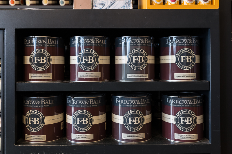
I have a personal favorite plan for rooms that don’t get heavy use (think bedroom, living room, office). I like the 20% Sheen (Estate Eggshell) on the doors because it is washable and wipeable. I also opt to paint my base boards, casings, bookshelves, and architraves in the same smooth, velvety finish. Keep in mind that Farrow and Ball Eggshell is different than what Americans generally think of Eggshell. The Farrow and Ball version has more sheen.
Then for the walls I like the dead flat look of 2% Estate Emulsion. This is the Farrow and Ball signature paint, and I love their inexplicable chalky finish that has so much depth and character. It immediately transports me back to our time touring British mansions and manor houses. It feels so stately and gorgeous.
If I were painting a room that received more traffic (think a kitchen or bathroom), but I still wanted it to retain a flat feel, then I would opt for the 7% Modern Emulsion on the walls and still use the 20% on the trim.

This is the Estate Emulsion with Estate Eggshell on the trim (Setting Plaster)

One of my very favorite looks is a high gloss on everything. While this choice requires a bit more care in application, the results are high drama.
Farrow and Ball Tip 3:
Don’t skip the Primer
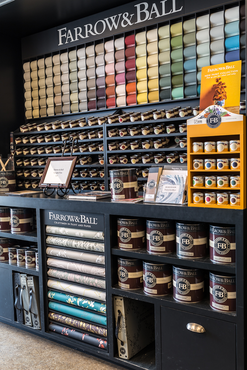
Farrow and Ball offers seven different types of primers. So, whether you need to paint over metal, hardwoods, interior, exterior, masonry, knotty wood, or just plain walls and ceiings….they’ve got you covered…no pun intended. Each of these come in different shades to coordinate with the color of paint that you are using. My stockist, Potomac Paint and Design Center, helped guide me through which primer coordinated with my latest project. They also continue to ship during the Corona virus quarantine.
In order for the Farrow and Ball pigments to look their best, it is important to use a primer. I have been very impressed with its quality and I want to show you two different examples of two Farrow and Ball primers used in two different rooms in our home.
Master Bedroom Before Farrow and Ball primer

Master Bedroom AFTER Farrow and Ball primer (1st coat)

Office BEFORE Farrow and Ball primer
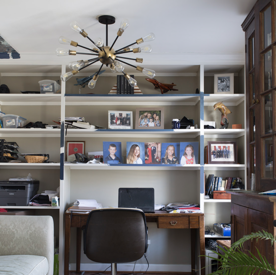
Office AFTER Farrow and Ball primer (1st coat)
By focusing on even primer coverage, I was able to get a beautiful finish in both rooms. Note: These are both Westward facing rooms which recieve more intense afternoon light.
Farrow and Ball Tip 4
Consider Farrow and Ball wallpaper

I have always known that Farrow and Ball had lovely wallpapers, but it wasn’t until I let myself imagine and dream a little that I realized just how much I truly love many of them. I have an upcoming laundry room makeover on the docket, and two of the lovely papers have made the short list.
Plus, Farrow and Ball has taken the guess work out of matching the paint color. They make life easy and give you the best suggestions.


Farrow and Ball Tip #5:
Stirred not Shaken
While I don’t personally drink alcohol, this is a witty way to help me remember one important point when using Farrow and Ball. For best results you don’t shake the paint, you stir it. I was glad that Potomac Paint and Design Center reminded me about this important point.

Stockist are There For You!
Perhaps the BIGGEST TAKE AWAY is that you are not alone in these decisions. Farrow and Ball has excellent stockists. I have been very happy with the service I received at Potomac Paint and Design Center. They ship, so you can receive over the phone guidance and order receive your paint, regardless of where you live. They also have curb side pick up if you are local to DC/Northern Virginia.
I hope you have enjoyed your time here. Feel free to pin to your heart’s content and join me here:

This article is brilliant! Thank you for telling us the “how things work portion” of natural light. It’s so important and so often overlooked. I’ll never skip the primer now and I’ll feel so much more confident in my selection process now. Thanks Jewel!
Oh Good! I’m so glad to hear that it was helpful!
I stumbled on your site & insight while attempting to demystify how to use F & B paint. Grateful for your tips. Still too intimidated to attempt myself. Do you provide your good taste virtually, in the form of consultation? I would love to be able to access a professional on an “at will” basis, as needed.
Hi Dawn! Thanks for reaching out. I plan to have some availability after the holidays, but understand if that is too late. If you are looking for pure color consultations you can try your local Farrow and Ball Stockist. I have suggestions if you need them.
Thank you for this post! I have been considering Setting Plaster for my north-facing living room, but the sample that I put on a poster board looks more yellow than expected — more like a skin tone if you know what I mean and not as much as a soft blush like it looks in your photos. I don’t know if that might change once it’s on the walls??
And, do you paint your moulding eggshell too? or just the same as the walls.
Yes! It definitely changes in different lights. My bedroom is westward facing so gets baby pink in the afternoons, tan at night, and somewhere in between in the mornings.
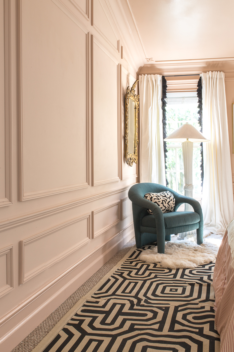
The room with the panelled walls and green chair – what colour is on the walls, please?
Hi! That is a Parma Grey knock off but I wish I had gone with the real thing. The color match wasn’t very accurate.